Eurocharts Blog
How To Make My Notice Board Look & Work Better
So paper on a wall is never very pretty but in the current world both at home and at work we need calendars, signs, posters, legal information, timetables – you name it – displayed on our walls. The standard method of displaying information is to group it together in one space on a board. Whether it be in the office, a car garage, a school reception or in a hotel, Notice and Bullet-in boards still have an effective role in our lives amid all the technology. With a little bit of effort there are ways to make them neater and more attractive and although it will never reach ‘Gallery Wall’ status we can certainly do better than a wonky A4 sheet pinned to the board. Try these simple yet effective ways to make your Notice board look better today!
- Red and Yellow and Pink and Orange and Blue! Pick a few colours that complement each other, this could be your company colours, your favourite colour or simply what you have to hand. Making the displayed information visually appealing will help to grab peoples’ attention. Tip – if your current notice board colour doesn’t suit your theme don’t rush out and buy a new one, use large sheets of sugar paper to cover the board before creating your display. You can even section different areas for different functions using this method. Buy a mixed colour pack here (WHSmith)
- Size matters! Don’t be stingy on the size of your font or any pictures you want to display. Think optician’s surgery, no-one can read the bottom line. You’re creating a display for people to see information so let them see it. Select a font that isn’t fussy but is easy to read and use a large font size, the simpler the better!
- You light up my life! Have you got plug sockets nearby and any left over lights from Christmas? Use these to your advantage, even an LED strip light can jazz up a display by just being there. Not got any spare? Your best friend Amazon.co.uk can get these to you in no time at all (depending on what type of driver your local delivery man is!)
- Double trouble! Make your display as symmetrical as possible. Now we don’t mean to put up two of every sheet but simply plan the layout before sticking things on. Think of each side as sisters not twins, where one side has a portrait A4 sheet, make it so the other matches. A balanced display is easy on the eye, especially where you have a lot of detail in one area.
- The world doesn’t revolve around you! Well that’s where you’re wrong! Put the most important information in the middle, this could be something that gets updated regularly or something people need to see i.e. instructions on where to sign in.
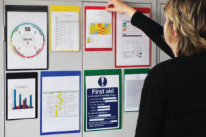
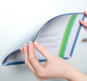
- No more pins and needles! We all know how annoying drawing pins can be, they’re never around when you need one but always there to get stuck in your shoe. Why not try Document Display Pockets? Now these are a game changer! No matter the paper size needed, these have you covered. Need to change the display up? No problem, these can be quickly & easily moved around. These are so simple to use, they attach to any board (or wall) surface and you can literally use your little finger to slide paper in and out. With an open front design you can write directly on the paper or if this is something you’re trying to avoid (think pesky teenagers) you can use the transparent fronts to stop anyone drawing unsavoury things! And with so many colours available there is one guaranteed to take your fancy (and match your colour scheme)
- Make a house a home! Yes your display needs to look good but it also needs to work within your environment, make it functional. Does any information need updating regularly? Think cleaning checks or tea rotas. Have a pen to hand and make sure it can’t go walk-about. Forget about the old ball and chain pens that are barely long enough to hold yet alone write with, we’re talking about Pen Clips. Think of it as a little circular home for your pen, these round magic pen hugging beauties will change your life and they can also match your colour scheme – win win!
- Dynamite! Although a Noticeboard can be dynamic and multifunctional, try not to change it up too often. If people use the information regularly, i.e. timetables, contact details – it is best not to mess around with it too much, just because something can be changed doesn’t mean it should. Familiarity is the key.
- Frame Camera Action! Forget about the Aluminium frame, make your own border. You can use leftover party decorations, leaves (real or fake), staff photos, ribbon, even strips of paper to really make the board stand out. On a budget? Just decorate opposite corners.
- Your opinion matters! A simple way to bring people to your noticeboard is to make it interactive. Ask for their opinion, it could be about the workplace, thoughts on the free snacks available or even on the board itself. Give them the opportunity to make themselves heard. An easy way is to use Rainbow Pockets, these allow people to write their opinions down and slot them into the pocket for you to remove but is also draw them into your display board resulting in an opportunity for them to consume the other information on the board.


